


The Pink Pioneer
In 1961 Bobby MacLeod the owner of the Mishnish Hotel chose to paint his waterfront building a vivid pink. This wasn’t a whimsical decision it was a bold marketing move. With increasing car traffic on the A849 and growing numbers of ferry passengers arriving from Kilchoan MacLeod wanted the Mishnish to stand out. That bright pink façade quickly became a landmark on the Sound of Mull and drew in curious visitors and overnight guests. The pink colour remained the building’s signature for decades and was later changed to yellow following renovations but it’s widely credited with kickstarting Tobermory’s colourful waterfront tradition.
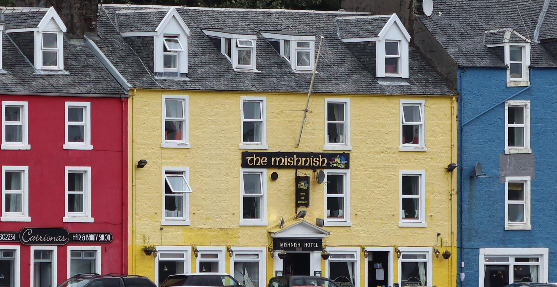
The Mishnish in Tobermory with it striking yellow color.
The Driving Revolution of the 1960s
The 1960s saw a surge in self drive holidays across the UK. Families packed into rented cars and headed to coastal destinations using winding roads and ferry crossings. In this era bright colours became a useful tool for attracting attention. Seaside towns across Britain used bold paints to market accommodation and dining venues. In Tobermory owners saw the impact of the Mishnish’s pink paint and began to follow suit applying vibrant marine grade colours to their own properties. What began as roadside visibility soon became a visual identity for the harbour.
Neighbourly Copycat Colour
Once the Mishnish made its mark local businesses and residents took note. By the late 1960s neighbouring buildings began adopting bold hues. Pastel blues buttery yellows soft greens and coral tones appeared along Main Street forming a harmonious patchwork that blended individuality with collective charm. The visual appeal was immediate and lasting. Tobermory’s harbourfront was no longer just functional—it had become a destination in itself recognised by its vibrant palette and praised in guidebooks and postcards.
From Trend to Heritage
In 2001 the local council designated Tobermory’s waterfront as a conservation area. This formal recognition helped preserve the harbourfront’s existing colour scheme locking in the legacy of the 1960s and 70s. Property owners now repaint using approved shades drawn from the original spectrum ensuring continuity and protecting Tobermory’s visual heritage. The colours aren’t just cosmetic—they’re historical markers of a town that embraced creativity and turned it into culture.
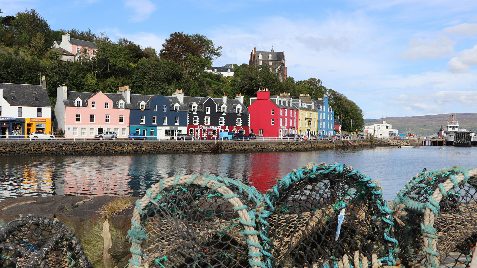
Tobermory’s vibrant colourful buildings.
A Living Legacy of Colour
Today Tobermory’s painted facades remain one of the most photographed features on the Isle of Mull. What began with one pink hotel transformed an entire street and shaped the identity of the island’s capital. Over the years the Mishnish transitioned from pink to yellow but its foundational role is unchanged. The rainbow row stands as a tribute to local initiative the tourism boom of the 1960s and a community’s ability to turn style into substance. It’s proof that one bold idea and a tin of paint can create a legacy that spans generations.
Conclusion
Tobermory’s colourful harbour isn’t the result of ancient maritime custom or folklore. It’s a mid twentieth century success story born from smart marketing and neighbourly inspiration. The pink painted Mishnish Hotel lit the fuse and throughout the 1960s and 70s the waterfront blossomed in vibrant tones that still define the town today. From local pride to visual charm the colours continue to speak for Tobermory and welcome every visitor with the same cheerful flair imagined over sixty years ago.